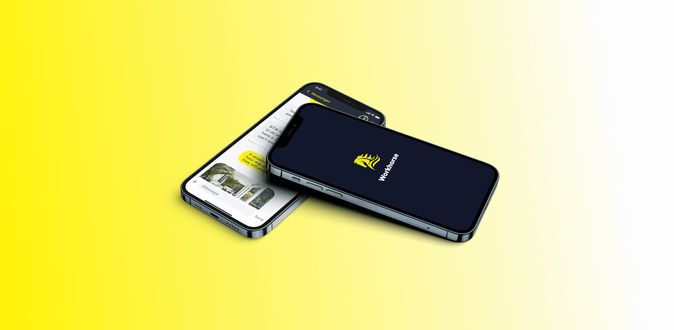
Workhorse
Aug 21, 2022
Background
Workhorse asked us to create a entirely new way for technicians, office managers, and clients to communicate, so we created Workhorse, the best communication focused CRM ever.
Design Considerations
Final Deliverables
Admin web application
iOS and Android app for both admins and technicians
Roles
Super Admin - Workhorse employees. Full access to all companies and all users etc.
Admin (account holder) - Full access to a given company account.
Field Technician - Person working at the job sites. This could be a foreman, technician, or other worker.
Design Process
Everything starts with the log-in screen. We started on mobile and focused on what information the devs needed to setup the different API’s and services needed for communication. Using the brand colors, we created a dark themed interface with yellow highlights for interactive components. We also used some illustrations to provide examples of how the product can be used.
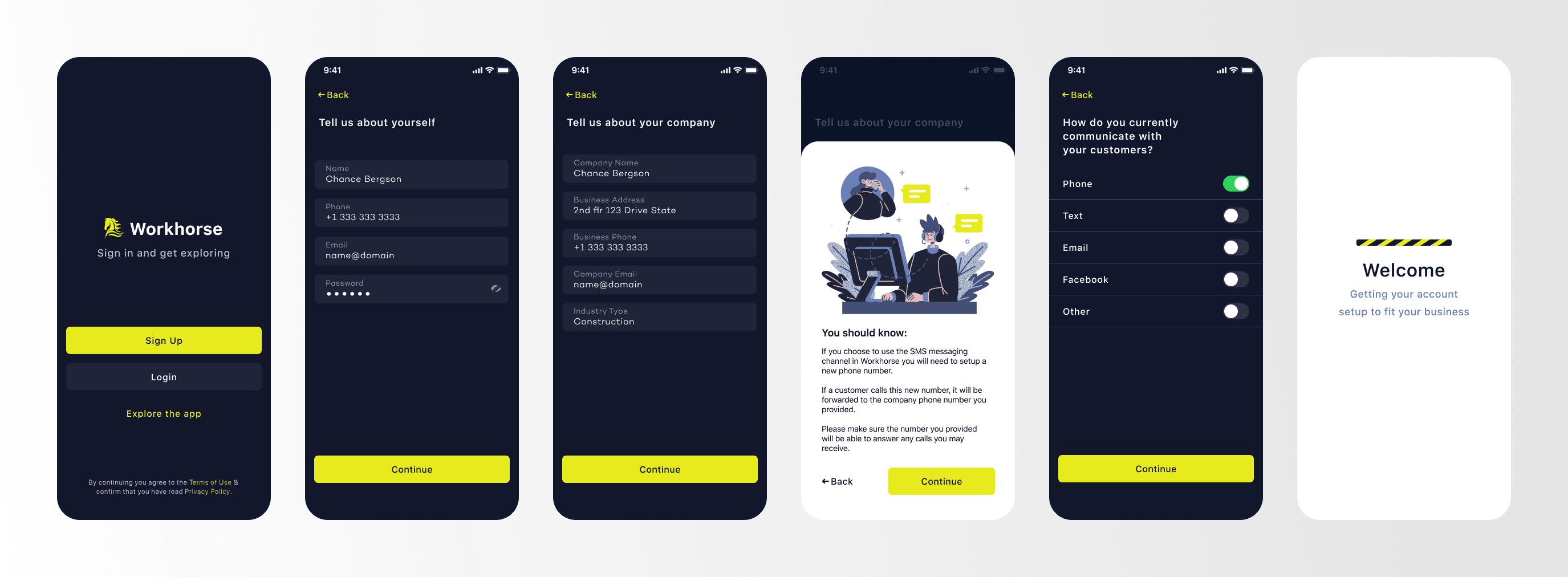
Starting with the log-in screen helped us set the tone and design style we would use throughout the rest of the app.
Messaging
Messaging was a fundamental part of the app, so we spent a lot of time designing and refining how messaging would be handled. It became extremely complicated due to a third-party managing the back-end process, and because multiple people could potentially interact with a single customer in the same chat.
After many different iterations, we decided we would manage conversations based on “ownership”, which means that only one admin could “own” the conversation and interact with that user. If another admin needed to contact/interact with the customer, they would need to take ownership of the conversation, and reassign the conversation to themselves. Other users would be able to view a conversation, but they could not interact with the customer.
This also allowed technicians to view conversations as they were happening, so they can stay informed without constant updates from the office admins.
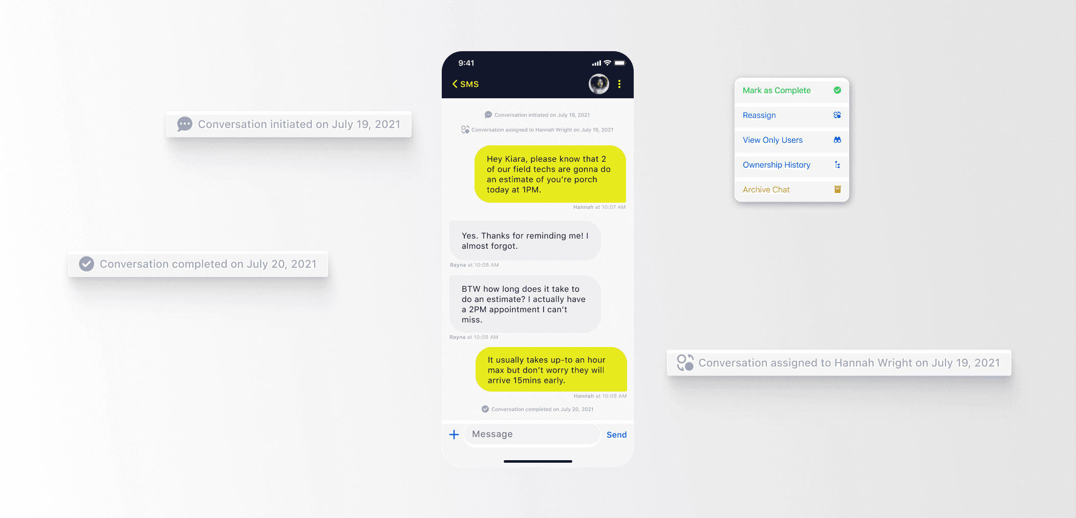
To help maintain order, we added these helpful timeline tags to show all admin changes, such as reassigning or completing a conversation.
Because we were using the Gmail API, we decided to keep most of the major components Gmail’s app established, this provided a consistent UI for all users. But we still made the design our own by incorporating the styling of the rest of Workhorse, and created a tailored experience for Workhorse users.
Facebook Messenger
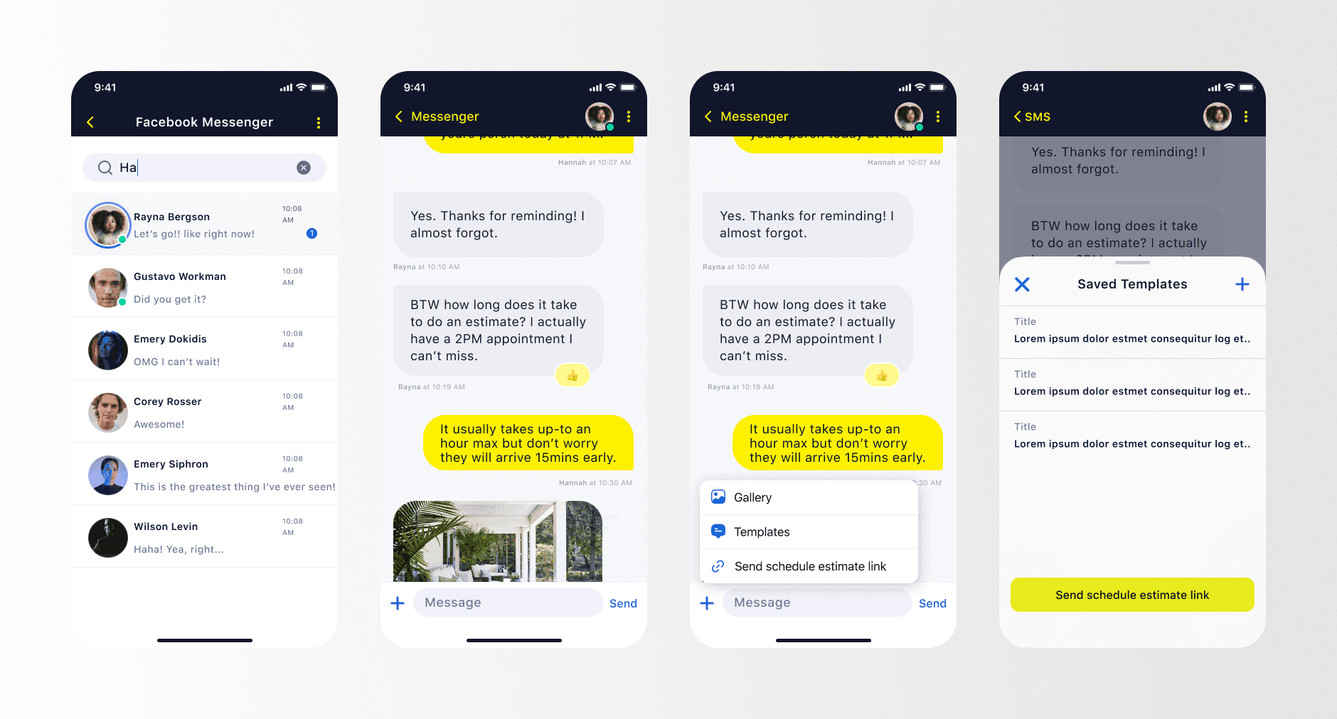
Messenger was a new challenge for both our developers and design team. Facebook’s API can be a little challenging to work with, so the designs were reconsidered quite a few times. However, we remained consistent with the SMS messaging feature, and supporting Messenger allowed us to add a few more features, such as picture and location sharing.
We also added a handy feature to all of the communication channels: Templates! These are so helpful as a customer service rep.
Desktop
We always knew how important desktop would be for Admins, so we worked really hard to make sure all of the same amazing features we had established on mobile were fully supported on desktop, as well as plenty of new features. Desktop designs were started shortly after mobile, and both were created in tandem to maintain usability and consistency.
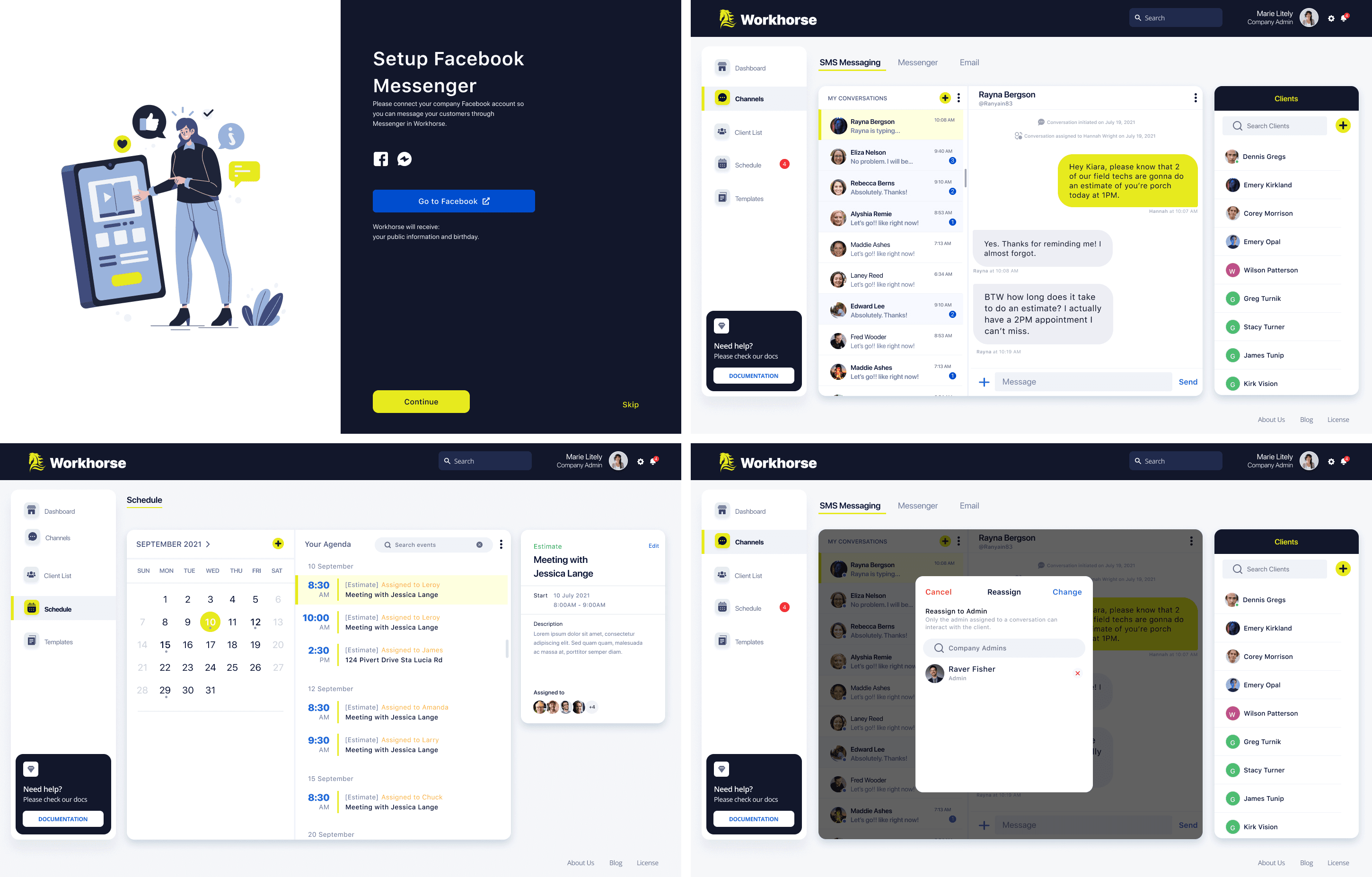
Desktop Layout Structure
Every screen is split into three main sections: Side bar navigation, primary content section, and the context based section. The context based section is a fluid section that changes depending on the primary content section. Such as when in SMS messaging, it shows the client list so a user can quickly review account details while talking with a client. Or when viewing the schedule, a user can view any event details as well as manage those assigned to each event.
This allows for a very flexible interface that has clear hierarchy using content prioritization, which creates a focused experience for users.
Client Self-Scheduling Process
This process would allow an admin to send a link to a client/prospective client to finish scheduling an appointment; or so a business could add the link to their website, which would allow a user to schedule an appointment without contacting the business. We designed the scheduling process to be as simple as possible and to be completed in a few steps.
We wanted the user to maintain focus on one objective, then move to the next. To maintain this, the forum layout is slightly differently between the mobile and desktop apps.
Desktop
On desktop, the interface is just one short forum, but it is spaced out in a comfortable way to create a focused environment no matter where you are on the page. I’ve also set it up so if the user selects “Get Started” the page will scroll to the next section.
Mobile
Because the keyboard was likely going to be active for the majority of the interaction, further limiting the screen size on mobile, we decided to split up the form and use buttons to move between the different objectives. This helped manage space so much better than trying to match the one page layout on desktop.
Project Reflection
We learned a lot about working with different API's and managing user flows when working on this project. There were a lot of unexpected roadblocks that drastically changed the design requirements, and we had to work closely with the dev team to be flexible with one-another's needs.